Tuesday 10 May
From standing out in the endless scroll of social media to giving something special to a core subscriber base, designing a cover has never been more complex. So BSME committee member Hattie Brett quizzed some of the industry’s best creatives to ask what makes a great cover today. We found out what tactics a cover needs to have newsstand appeal now, how to create a cover that travels on social media and why engaging with platforms like Apple News+ can help drive reach and engagement.
This event at Shoreditch House in London was attended by nearly 100 magazine makers and creatives who came to hear the wisdom of Chris Lupton, creative director at Empire, Deborah Joseph, European editorial director at GLAMOUR, and Chris Barker, art director at Campaign. Marshalling proceedings was BSME committee member and award-winning editor of Grazia, Hattie Brett.

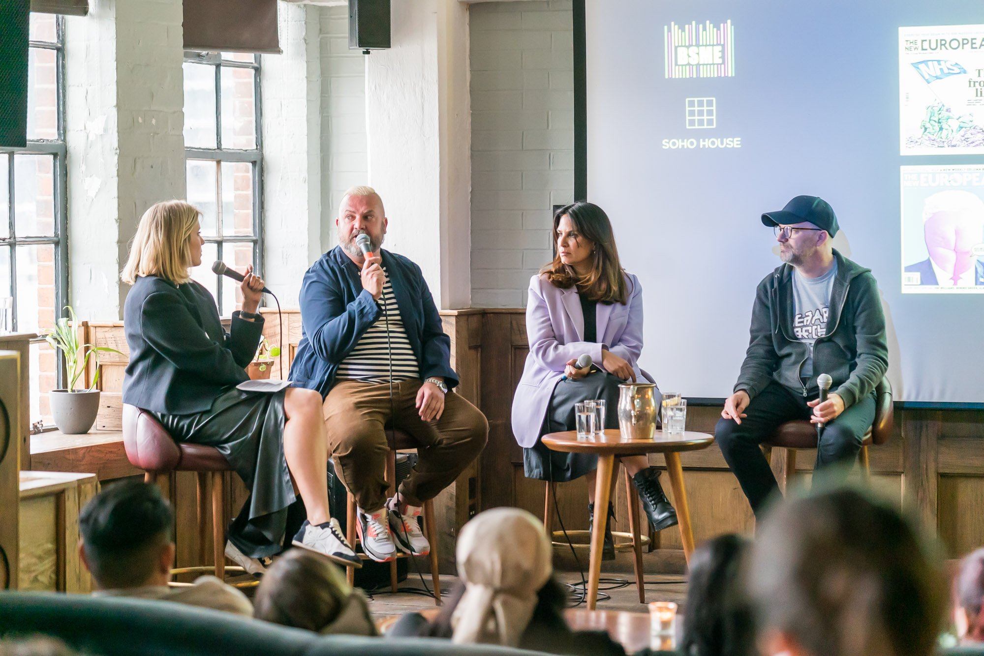

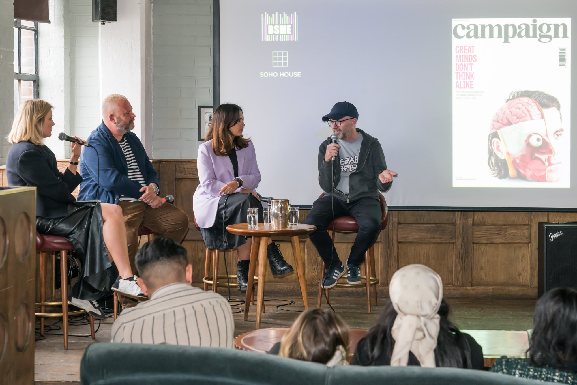




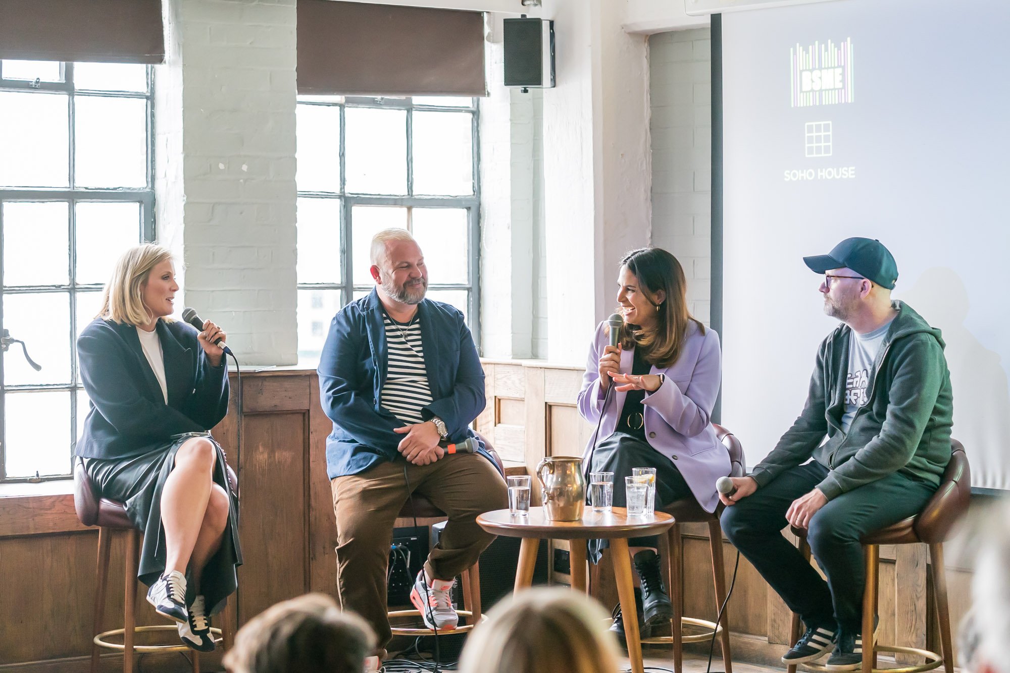
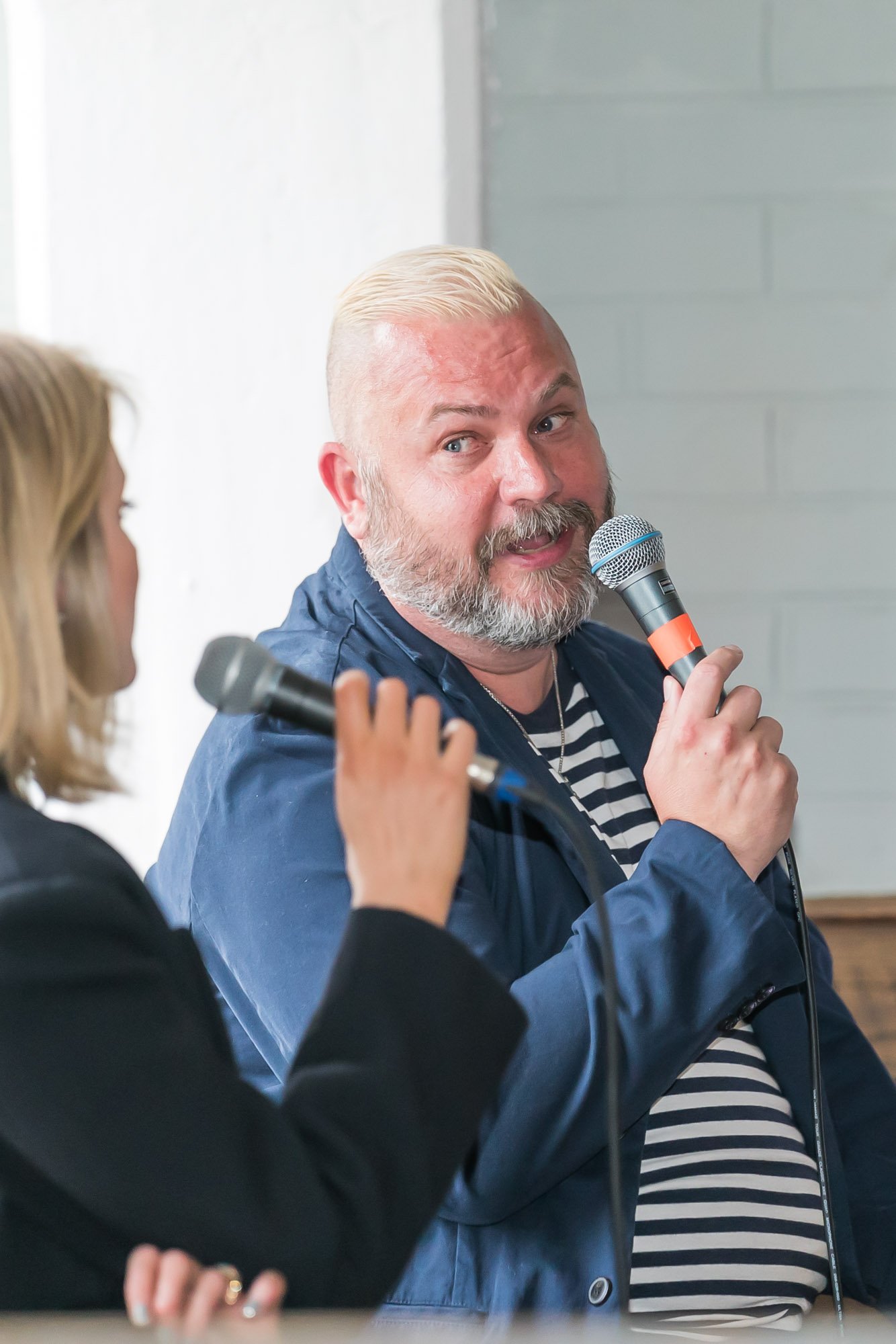
Photography: David Cotter
Our 2022 chair Tim Pollard was on hand to pick out the trends, hints and tips to help you make better decisions on your titles. Below is the BSME’s round-up of the secrets to making stand-out magazine covers for every platform.
Revealed: the secrets of making brilliant magazine covers that work on every platform
The BSME hosted a session on best practice for multi-channel magazine covers this week and our 2022 chair Tim Pollard was on hand to pick out the trends, hints and tips to help you make better decisions on your titles.
1) Lock down a brilliant concept first and everything else follows
Planning is all, our panellists agreed. Joseph described how GLAMOUR shoots one hero video for a cover shoot and plans bespoke edits for different platforms in advance. ‘It’s important we have the right assets planned early on,’ she said. ‘It’s not about coverlines or the top-right “hot spot”,’ reckoned Lupton of Empire magazine. ‘It’s all about the stand-out image and the choice of movie on the cover for us. That’s our secret weapon.’ He works with his editor and team, who plan covers up to three years out. ‘Bounce ideas around and think through what treatments work on different channels. My colleagues are the best sounding board of all - if we like something, we stress-test it and keep improving the idea. Editorial instinct is so important for cover creation.’
2) Experimentation works – be bold
The rules of magazine covers are changing fast – and the pandemic has driven more innovation and creativity. Barker joined Campaign during lockdown and describes an extraordinary period where shoots were difficult and his art team had to think laterally to create stand-out front covers. They experimented with concepts using still-life models, while Lupton described using illustrators more frequently to craft controlled cover images. Joseph’s team sent smartphones to celebrities to let them shoot their own cover images – producing more personal, behind-the-scenes imagery of their homes and families. Be bold. Be brave. Don’t be afraid to innovate.
3) For digital channels, be clear on what your objectives are
‘It’s imperative that you decide your strategy before you shoot,’ said Joseph of GLAMOUR, which flipped from print to digital covers five years ago. ‘Be really clear on what the metrics are for every platform – whether it’s views on YouTube or engagement on TikTok. Measure your performance and be clear what success for a cover looks like.’
4) Grab readers’ attention fast
Different age groups make purchase decisions differently, it was revealed. Traditional magazine buyers may ponder a cover for 20 seconds or longer, whereas millennials spend half that time – and evidence suggests that Generation Z will pause for just 2-3 seconds before deciding whether to engage, said Joseph. ‘They must like it instantly,’ she said. ‘Is it colourful? Does it stand out? You have to grab them quickly on Instagram before they scroll past.’
5) Use your budget wisely
The magazine makers on the panel agreed that editors and art directors must focus on the right channels. Even big-budget brands can’t create bespoke covers for every single platform – so focus your efforts where it counts. ‘I’m fiercely protective of my budgets,’ said Lupton of Empire magazine. ‘We sit down early on and decide whether a shoot should include video or not – but the print cover is always our main focus. Everything stems from a brilliant magazine cover.’ And don’t worry if your budget is tiny, or zero. ‘No budget means more creativity,’ advised Joseph. To prove this point, Barker explained how during lockdown Campaign asked advertising executives to get their children to illustrate the cover. A good idea can cost nothing.
6) Different channels have different rules
‘I used to think that coverlines were important – and they are, in print,’ said Joseph. ‘But we use them less and less in digital channels. It’s the person and image that are important. We use coverlines less and less, maybe relying just on the name of the celebrity. I’m an original print magazine editor and I’m shedding lots of what I’ve learned.’
7) Your business plan should underpin your cover strategy
Newsstand sales are still crucial for most titles – be sure to align your time and resources with your business plan, advised Brett. ‘It will depend on your publisher’s strategy,’ she said. ‘For us, newsstand sales are central, but we find that Apple News+ is growing fast. We are in close contact with the Apple team and discuss how to create animated covers, learning from the data about what works and what doesn’t.’ Joseph agreed: ‘Find out where your audience are and focus on those channels.’
8) Designers are really good at coverlines!
Barker described how magazine art desks are surprisingly good at words too. ‘I’ve written so many coverlines in my career – designers often have that knack of honing in on the right line!’ he said. ‘We often think of the image and the headline at the same time. In that regard, a good cover is the original meme: it tells the story immediately. It’s like a good joke – you have to get it quickly. Nothing annoys me more than a weak coverline.’

