“A truly great magazine cover surprises, even shocks, and connects in a nano-second”
George Lois (Esquire)
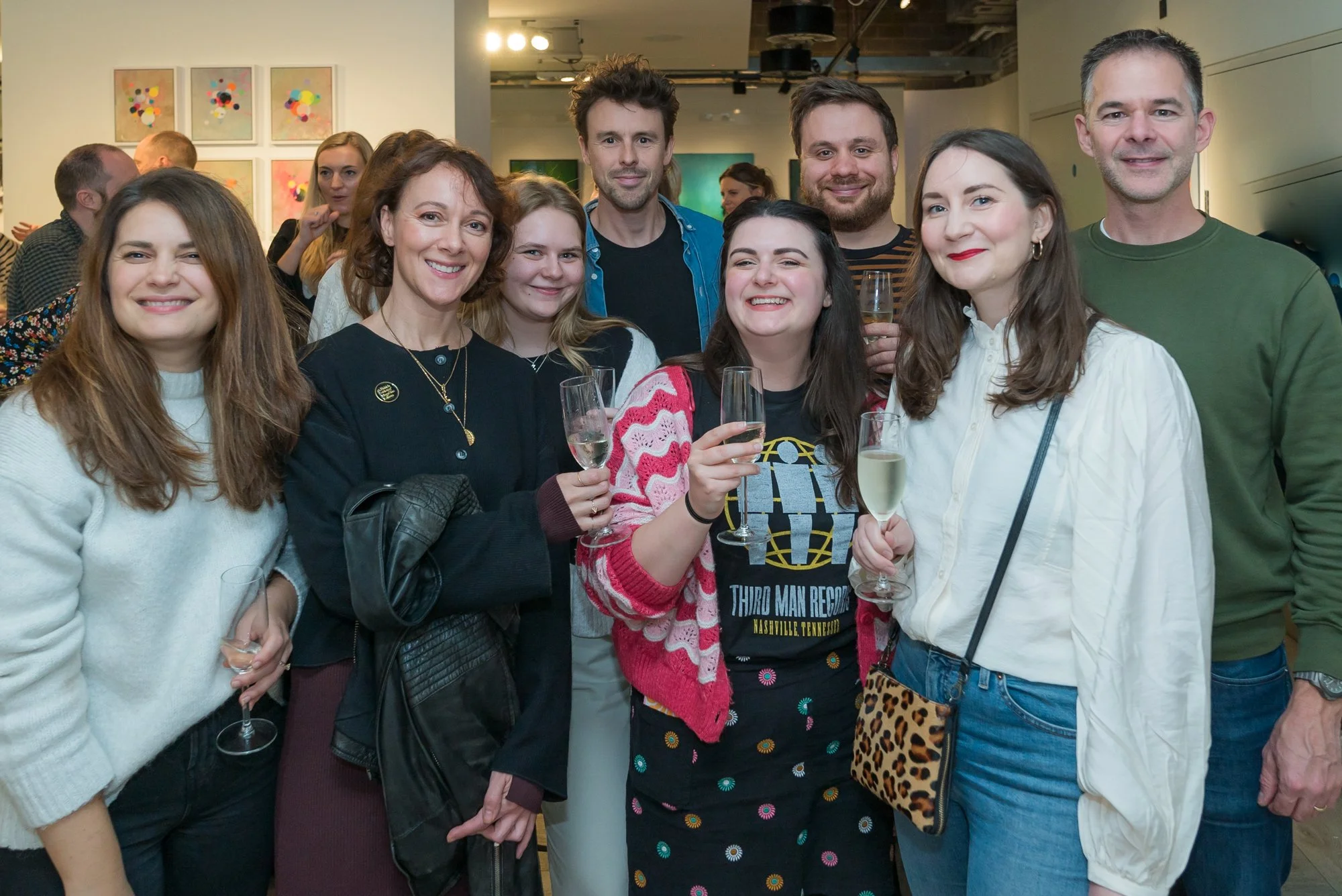
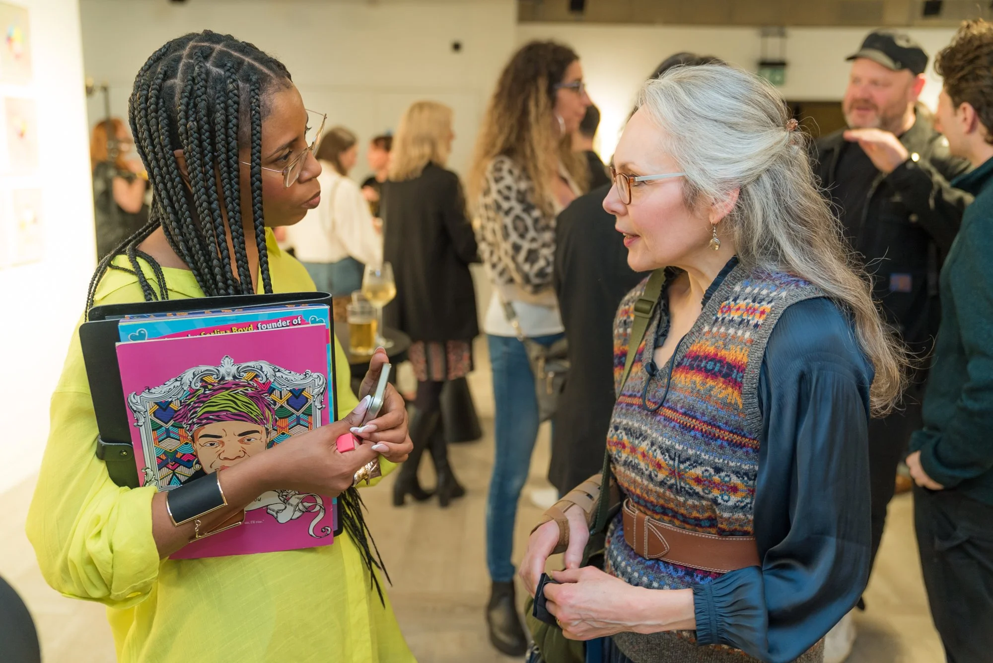
The Bankside Hotel was buzzing on Tuesday night as seven titans of the UK magazine industry gathered to discuss the art, craft and business of making killer covers. The BSME’s The Cover is Now! event is one of the most hotly anticipated in its annual calendar. The panel, hosted by Dan Jolin, editor in chief of Senet magazine, featured insights from Serlina Boyd, publisher and CEO of Cocoa Girl and Cocoa Boy, Holly Catford, art director at Pit, Sonny Dhamu, group art director at Inside Housing, Jaime Lee, UK art director at Cosmopolitan, Chris Lupton, creative director at Empire and Bryan Mayes, design director at Time Out London.
You can watch the recording and read 5 things we learned below.
5 things we learned:
Ask: Who are your covers really for? Every brand is reaching out to a different audience, and a great cover scores a direct hit. Many art directors are making their covers with a particular person in mind. Serlina Boyd makes the Cocoa Girl covers for her daughter. With Pit Magazine, Holly Catford often creates covers that appeal to the indie magazine’s own sense of humour.
Double down on your offering. Both print and digital brands feel like they are doubling down on the things that are special about the format, and the things they do well. “I actually think we're in an era of independent magazines,” said Chris Lupton. He loves the buzz he gets from releasing Empire’s special subs covers, while Pit Magazine limited-run covers (famously, one came with a baggy of MSG) become collectable works of art. Cosmopolitan’s digital covers include live footage from shoots to bring their cover stars to life.
Less is more. Ditch the clutter. Multiple line covers are dead. The assembled art directors agreed (mostly) that short cover lines no longer seem relevant. “Less is more,” said Sonny Dhamu from Inside Housing, who goes for the classic combo of a strong image, headline and standfirst. For Jaime Lee, however, Cosmo’s tried-and-tested formula of six coverlines showing the range of content still works for the newsstand cover.
Don't shoehorn in animation. Bryan Mayes warned against trying to be too clever – “Only do it when it enhances the concept and the idea that you've already got, rather than just thinking, I can do this, so I should.” Chris Lupton was sceptical about AI-designed covers, “ I just want AI to make my life easier, so I can do the stuff that I want to do. But it's never going to get away from me commissioning photographers and illustrators.”
Offer something unusual. Magazines are realising that audiences want more from their subscriptions. Empire is offering tiered access to exclusive events and content. Cocoa Girl has opened a journalism school for children, and is getting kids involved in the writing and production of the mag.
Learnings written by Devangi Sharma, journalist.


